Tuesday, August 23, 2011

Design Contest: Libya


Do some designing and help out a country!

The peeps at GOOD are looking to create a functional, better-looking Libya leaflet using an actual NATO slogan: “One Libya, One People.” They have been dropping propaganda leaflets around trying to quell the violence, but the ones they are using have not been working.

What they're asking for is something a little more compelling than this:


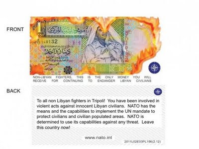
While I think the people of Libya are looking for something more than just well-designed pamphlets in response to their anger, it couldn't hurt to try.


http://www.good.is/post/project-desgin-a-better-looking-libya-leaflet/

Get Connected, revisited

Last summer I interned at a company in London called Get Connected (http://www.getconnected.org.uk/). They are a non profit dedicated to helping young people find 'help' and will connect you for free to your specific hotline. They were undergoing brand reconstruction at the time and needed new material..... so a year later I'm revisiting my first graphic design project.

here's the original.


here is my revision:

Sunday, August 21, 2011

Final Work - 10 goals


10 goals poster

Final work - Infographics

infographics
These are for my job at the Stanford Daily newspaper. (www.stanforddaily.com)


Final Work - branding

In the thrift store, I bought 3 records so decided to make a music label company.


some trial and error....


and finally


Bag/Record Cover


T-shirt
sorry about the awkward green lines, these are screen shots and I didn't turn off all my guides. (God bless guides!!)

Final Work - Posters


brought to you by:


Final Work - iPhone app


iphone app

Final Work - Book Covers


Here is a review of Infinite Jest (the other two can be found as well): http://www.goodreads.com/book/show/6759.Infinite_Jest

Final Work - 3 Feature Spreads

3 feature spreads


Tuesday, August 16, 2011

Friday, August 5, 2011

Typedia


This is a pretty cool typography website I stumbled upon... its userface is not the best (doesn't always show you the fonts themselves, just their names, and when I was searching for a "japanese" font it was hard to figure out where to start) but I think it is a good idea in theory.


http://typedia.com/blog/post/type-news-shoulder-check/

Thursday, August 4, 2011

infographic #2

http://www.stanforddaily.com/2011/08/04/stanford-will-respond-to-nyc-request-for-proposals/

this is another infographic I made... the colors are much brighter than I anticipated but other than that I am happy with it. comment please