Friday, July 29, 2011

Branding/Packaging Revisited

I went back to the packaging project because I never finished it. I bought 3 records for like a dollar each at a thrift store and was thinking of making a record company (like Sam Goody) as a brand.

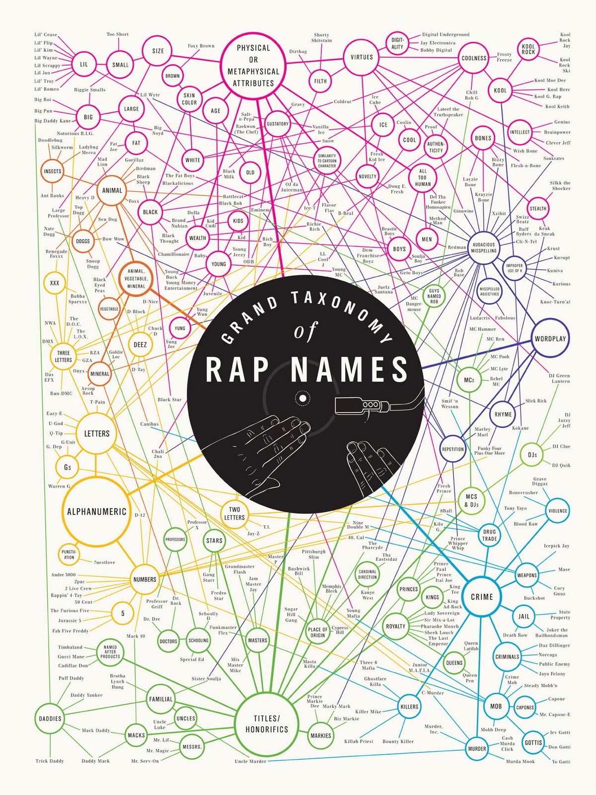
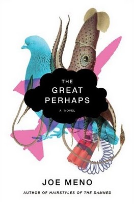
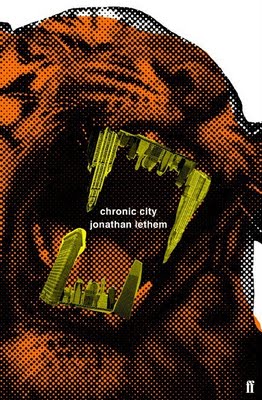
So here's my swipe...


making the logo was challenging. i went through many revisions but i'm happy with the final.


I'm still waiting for my printer to come, but here is what I am envisioning for the packaging:

(swipe)


FINAL PRODUCT....


(front)


(back)


T Shirt

long live the record industry!

Thursday, July 28, 2011

rappers infographic


http://blog.kobayashi.eu/wp-content/uploads/2010/09/poster_rappers_1300.jpg greatness. didn't realize there was a mack daddy as well as a daddy mack.

Every day posters every day

http://edped.tumblr.com/

This is really cool and some are very funny. They really hit the sweet spot, not to mention some are designed quite well

Wednesday, July 27, 2011

Infographic


This is for my school newspaper- it is a measure of the matriculation rates. it is a little cut off because it is a screen shot but whatever, it's an interesting read.

Designing Objectively

This is a good article on designing objectively. It's our job as designers to make sure no emotions enter the scene, lest the piece become a work of "art". This article explains why design only works one way, and how to learn to get there. Check it out.

http://fishofthebay.com/posts/objective-design

Sunday, July 24, 2011

Random bits of swipe to end the night...


infinite jest option 2


vote!

#infinite possibilities


option #2. k now time to watch entourage.

by the way...


i remembered the inspiration - sutton hoo burial ground from the early 7th century. Here is a link to the british museum. http://www.britishmuseum.org/explore/highlights/highlight_objects/pe_mla/p/purse_lid_from_the_ship-burial.aspx

This is exhausting

We'll see if 3 come out of this!! Geometry is hard!


Did I say Tim OBrien? oops....

So I totally lied. I am not doing Tim O'Brien - although I may revisit that. I am doing David Foster Wallace.

For some reason, the typography took kind of an olde english turn - kind of like .

I learned in art history about some curvy, figurative design which came from the early first millenia but I can't remember its name..

but I am taking my inspiration from these kinds of designs - sort of like that "S" that everyone would draw on their notes in high school

Saturday, July 23, 2011

3 books

i chose Tim O'Brien's novels-

In The Lake of the Woods


The Things They Carried


If I Die in a Combat Zone, Box me up and Ship me home


they are war memoirs from vietnam told on a fictional basis but with a very "true" sentiment. they are understandably disturbing, poignant, and very powerful but told in a simple manner that some might miss if they are not reading carefully. I am looking at this kind of swipe - big block imagery, faceless people, (almost like those pamphlets you get on airplanes regarding emergency exits) because they could be replaced for anyone else who lived through the war and its aftermath


great typography


hahaha

Thursday, July 21, 2011

Wednesday, July 20, 2011

greeting card, "Purple Wishes"

there is really a lot going on here... more than to what meets the eye at first


Greeting Card installation
Client - Seeonee for Grant Thornton
Size - Width : 2,8m / Height : 2m / Depth : 2m


from Behance